For our game (VASL), we have have literally hundreds of scenarios. I have created an extension that contains around 500 pre-defined setup files, organized into various sub-menus. That seems to work in theory.
But in practice I am finding that VASSAL displays only the number of items that can fit into a list matching the screen height, with no ability to scroll the list to display additional items on a given sub-menu.
Is there a setting or something I must use to allow the sub-menus to hold and display a large number (>50) items?
1 Like
I expect that all the items are in fact on the menu, but that the menu goes off the bottom of the screen so you can’t see them.
Menus with that many items are, generally speaking, bad UI. Better would be to split up the submenus into smaller chunks.
Yes, that is exactly what is happening.
I would prefer to be able to scroll a longer menu but your suggestion makes sense and I will go that route.
Thanks.
I’m trying to think of any application in use today that has scrolling menus and am coming up empty. I know there used to be at least one I used with some regularity, but what it was escapes me.
Thanks. Dividing the long menu into smaller sub-menus is quite doable without making it harder for users so I can easily go that way.
Must admit, I thought VASL had some fancy code to download maps from elsewhere. Very likely I was mistaken.
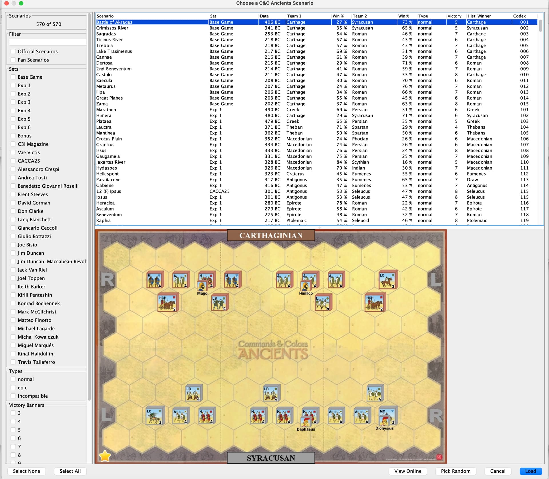
If you want to get into custom code, you could write a Scenario Browser, such as @bdgza provides in Memoir 44 (and kindly converted for C&C Ancients & Napoleonics).
The advantage of this is that it allows your users to scroll in a panel with alpha search and/or provide various filters and other info to help users find a scenario. A boon for long lists. The design in these modules is further complemented by scenario image and details drawn from fan-websites.
example:
2 Likes
VASL does indeed have some custom code (I am not able to judge if it is fancy or simply fanciful) to automate the downloading of maps, or to be precise, boards which are then used to make maps.
That isn’t quite what I need (want) here. Your image is closer to what I want but perhaps too much. I think @uckelman ‘s suggestion is the way for us to go at this point.
Thanks for the reply.
2 Likes
I have seen these often in mobile apps, for example to provide a person’s date of birth. The choices spin as if they were on a cylinder.