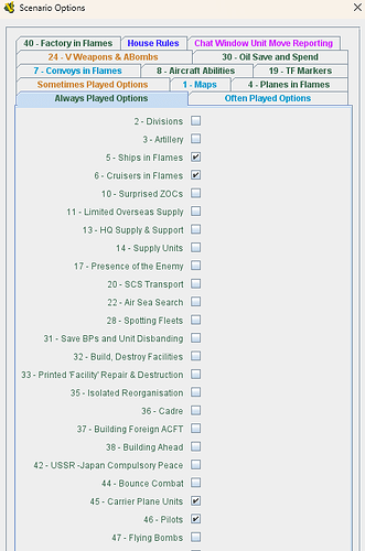
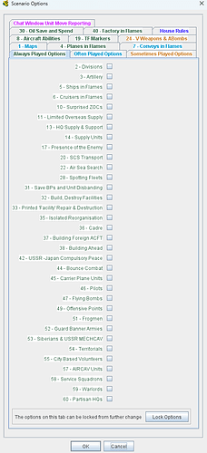
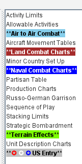
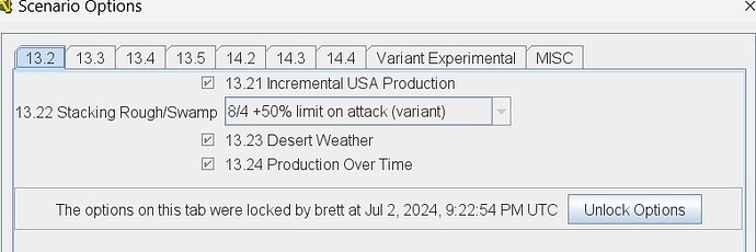
Here is an example of using html to colorize Scenario Options. Add html>font color=#0198ce>b> (< symbols removed) to the front of the text you want to colorize.
For the Scenario Properties Option Tab use the Name field.
For the Scenario Properties use the Option Prompt field.
Also thank you for bringing everything up. I like the way everything lines up following the Radio button.
I recommend against setting colors for UI elements. If someone is using a UI theme which differs significantly from the one you’re testing against, they may end up with illegible text and no good way to adjust it. The default text color has the great advantage of being legible against the default background, because they will have been chosen that way by the designer of the UI theme.
None of your green tab headings above would have enough contrast to be legible in a dark UI theme, e.g.
I’m not sure what you mean Joel. What the pic shows is perfectly legible. What other people do is their way to do things. What I use works for me and my module. The colors used are what the game designer used for the paper version of the optional rules.
Anyhow, I look forward to realigning those check boxes. If that means I have to wait a while for 3.7.13 then so be it.
What Joel is saying is that the default background color of those tabs is either white (not selected) or light blue (selected), but that default can be changed by choices outside of Vassal.
Other people may have turned on an Operating System theme that changes those colors, so that the background color for them may be, say, dark dark green.
In that case, normally,. the theme will change the text color to something contrasting, like white.
That won’t happen if you have set specific colors and these players will see dark green text on a dark green background.
Changing the OS theme does not effect Vassal on Windows, but who knows what happens on Super Linux 3.0?
I have seen complaints before about specific modules being unusable on certain operating systems because of the use of hard-coded colors by the developer.
It works. I specify the color. All else irrelevant. I totally fail to see how what I set up with my module has another affect due to another OS. The game module sets the standard. The OS does with what the module requires. I really think you guys are way over thinking this.
What is the driver here? You believe that what I see may differ from a user using a different OS. If that is the case, whose problem is this? Yours.
It’s never been good UI practice to hard-code colors in UIs which support themes. Dark mode UIs are common these days. You’re excluding many potential users with this choice.
As it is my problem, I aim to spend a little time investigating whether we can disable setting the colors of tab headings.
Ok. I do get it. Users may have something with the way their screens display stuff. Call me ‘thick as 2 short planks’.
However, all we have to do is insert our own stuff where we need to.
Voila. Add this to the aforementioned fields - html>span style=background-color:white>
No matter what a user has every scenario option displays as the module designer wants.
I like your statement re disabling setting the colours of tab headings. Good come back. ![]() I appreciate ‘man’ talk. Ever watch Gran Turino?
I appreciate ‘man’ talk. Ever watch Gran Turino?
What? No remarks?
I always use a background color to help highlight the font color.
That seems to do the trick for me and others, at least no one has said otherwise.
@Brent_Easton
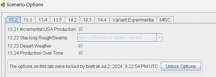
As I was afraid of, this change did in fact screw up my module…
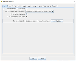
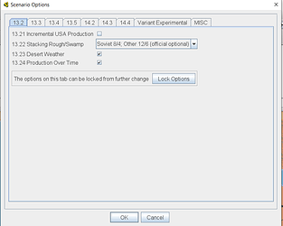
Screenshot using 3.7.12 (working correctly)
Screenshot using 3.7.13 (messed up)
I humbly request this change be reverted.
Given your concerns, I’m sorry I didn’t insist that you tested the interim build.
Fortunately, your module is not broken, just untidy.
You can change this in your module, there is a setting in the Checkbox property to control this, however, my plan was that existing modules should have retained their existing setting for this property.
I’ll look at correcting this.
Regards.
Thanks Brent!
I just downloaded and checked 3.7.14 and I’m still seeing the alignment problems…
Hopefully in 3.7.15…?
That’s expected. There were no changes in 3.7.14 which would have affected this.
I should be able to spend some time working on Vassal again soon.
Note that if you don’t want to wait, you should be able to fix your module by setting the ‘Description Alignment’ option in the Scenario Tab to ‘Left’, and making sure the ‘Move property description to right-hand-column’ in each option is not checked.
I’ve attempted to use the new settings to restore my module to how it’s supposed to look and it’s not working…
One bug: For a CHECKBOX SCENARIO PROPERTY, the definition has a checkbox “Move Property description to right-hand column.” When I unchecked this and saved the module, closed and re-edit, it is now checked again.
I think this bug is the root cause for why my module is messed up, something appears to be forcing this to be true, while it should have defaulted to false (unchecked). But regardless of the default, the fact that it can’t be changed by the module designer is problem…
Any chance of getting the fix to this in the next Vassal release?
Hi @Korval,
Could you please test the following build in Builds of vassalengine/vassal
VASSAL-3.7.16-SNAPSHOT-011273c-3.7-13791-Checkbox-Scenario-Property
and see if this resolves the issue.
Thanks.
WIN64 x86
I tested my old EE 3.3.1 file (created before the change to how Scenario Options work).
- Bug - text should be left justified by default.
For reference, the below image is what it looked like in Vassal 3.7.6 when the new feature was first introduced.
-
Move Property description to right… is NOT checked by default (good)
-
IF Move Property description to right… IS checked, now it can be unchecked and when saved/reloaded it remains unchecked (i.e., change works) (good)
