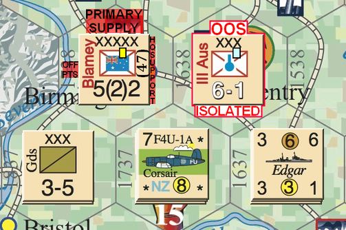
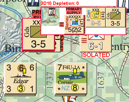
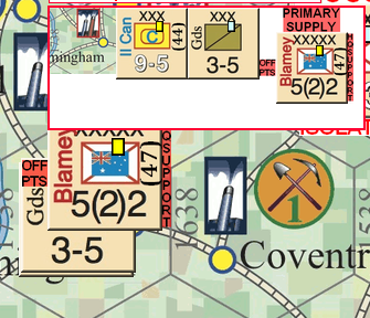
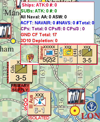
I’ve a bunch or counters that need to display certain things. These things are text based layers. They currently appear to the sides of the counters, left right, top or bottom. Trouble is, my POV, activating these ‘things’ also adjusts the way the counter displays. For example, layer is set to display at the top of a counter. The counter then displays that layer but it also ‘shifts’ (IAW its new pixel size) to the left/right/up/down in the mouse over stack viewer AND the map display.
I introduced this change (before they were set as a something overlaying the counter image), as their visibility on the game maps was not obvious. The ‘shifting’ of position in a hex negates the aim of the change.
Just ‘add’ the top/bottom/left/right layers to a counter. Don’t ‘adjust’ what is displayed on the map or via the MOSV.
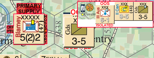
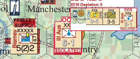
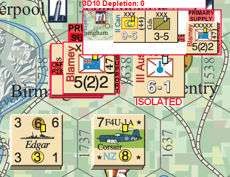
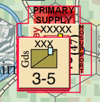
The pics try to convey this. The first pic is, literally, how the counter displaying these layers should be, even within a stack of counters of the same game piece layer. All centred in the hex. The remaining pic show the effects when stacked.
Can this auto adjust be turned off or something?
Your description and pics don’t make it at all clear what’s happening, but I am guessing that activating those extra layers is shifting the center-point of the counter, and therefore moving the counter so the new center-point is where the old center-point was.
Assuming that’s correct, the best solution I can think of is to add an invisible (transparent) border around the base images, just large enough to accommodate those extra flyouts. That way, the counters will stop changing size as you activate your additional layers.
Edit: Alternatively, make each of those additional layers much bigger, with all the extra space completely transparent, such that you’re adding the same amount of space on the opposite side of the counter as you’re adding to the side with the additional text (e.g., if the counter is 100 pixels high x 100 wide, and your “Primary Supply” text is 20 pixels high, add another 100x120 pixels of transparency below the “Primary Supply” text, so you end up with the counter image still centered in the overall combined image),
You would need ALL of your base counters to have that invisible base layer that covers everything. It will make the mouseover a little weird but that’s likely the best you could do at the moment.
The whole thing is getting ridiculous. I had thought of that concept fcolmenarez, but as you rightly point out it would be somewhat weird. ATM I’m just going with the ‘flow’ and sticking with the ‘minor’ display anomaly. I do not like it and never will, but there we go. The question remaining is WHY does Vassal do this?
The current implementation identifies the center of the piece with the center of the piece’s bounding box. You enlarge the bounding box in a way that changes its center when you add layers which extend outward from the base image.
You could try adding a Non-rectangular trait with the shape of the base counter as the last trait. That should lock the positioning of the piece into place regardless of any layers that are displayed.
So I need to extend the layer size to be equidistant all round? As in, if the top ‘display layer’ is 25 px high the resultant layer size needs to be 180 x 180 (based on original game piece being 130 x 130).
I need to think about that. There does seem to some anomalous logic here. Because, obviously, a layer size of 180 x 130 does not retain centre, when, to me, it should. The change, or layer, is concentric in the dimension of change. No change left or right and equal change top and bottom. Sounds very convoluted.
I’ll try that Brent. Best suggestion thus far. But then you are the programmers, I’m just a user. ![]()
The other issue is what happens to the other game pieces in the stack. Why do they move around when a layer that is ‘outside’ the basic trait pic activates on another game piece? The whole thing needs further thought.
I’ll advise on Brent’s suggestion when I get around to testing it.
Stacking has pieces all align the lower left corner of the bounding box, is that consistent with what you’re seeing?
