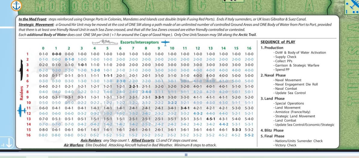
I wish to expand this chart to like 32 by 32. I started using WordPad but could quicky see that columns didn’t line up nicely. Something would always be off. Clearly the pros are using something that doesn’t do this. I never had a use in my life for anything better than WordPad to get the job done. What do you suppose was used to create this on the map? Illustrator? IDK… What’s out there that is free that can do a nice job like this. This is a question I’m sure any college educated office worker would know in an instant.
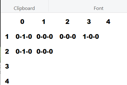
This is what I started in Wordpad. See how the top numbers don’t line up to the center of the tri-grouped numbers. Using spacebar to reposition isn’t helping. I believe the dashes in the tri-grouped numbers has introduced the problem. They take up less room than the actual numbers do. Perhaps there is a font in my list that keeps all this spacing uniform. Anyone know what that font may be called?
Any spreadsheet program should be able to do a decent job of it, or a word processor using an embedded table . LibreOffice and OpenOffice are both free and include both spreadsheet and word processor (among others).
If you really want to stick with WordPad, you would need to use a font labeled as “monospaced”.
2 Likes
Looking up monospaced fonts now. Thanks.
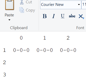
Courier new gives me the result I want. Looks lined up now. Thanks for the quick lesson in monospaced fonts.
An HTML table with appropriate CSS would do the job well.