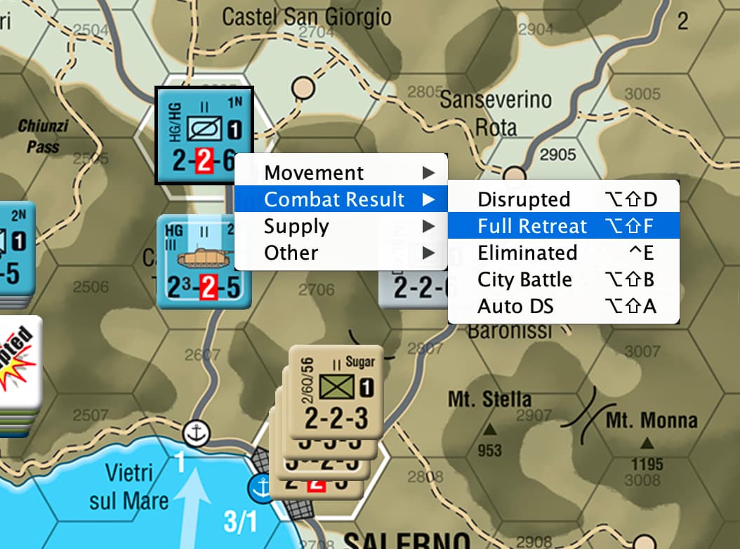
+1 from me. This would help readability in context menus, particularly since the text representation of modifier keys is used instead of symbols, as contrasted by marktb1961’s images above.
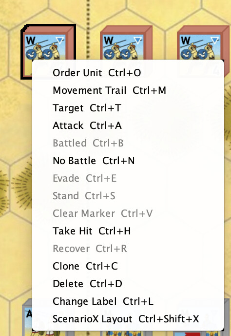
It looks to me that the way to support this is to (1) either use JMenuItem::setAcceleratorKey or (2) do something really funky with the layout of the context menu, like adding columns. The nice thing about [1] is you get symbols for free, etc.
Using setAcceleratorKey
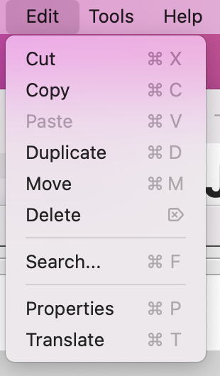
I’m guessing the issue that @uckelman refers to above is that the accelerator-keys are formatted according to Java look-and-feel defaults. (At least I think that they are.) Vassal uses a custom font when displaying the context menu text and so the accelerator keys do not match this custom font (by default). The way to get it to match is to override the default look-and-feel. And this does not appear to be possible for accelerator font.
If overriding the font for accelerator-keys is supported for some look-and-feels (e.g. windows) we could pretty easily support this on just those platforms.
Here is what things look like (with the bad formatting) on my Mac.
So… I have no memory of why we set a font for popup menus in the first place, and I don’t find any reason for it in the commit log. It might be that this is something ancient and predates the system-specific LaFs.
Would simply not setting the menu font solve the problem?
Okay, I think I figured out how to set the font for the key commands. Through google-fu, I found out that I can use the UIManager setting MenuItem.acceleratorFont. (Is this documented anywhere?)
This setting is global, but it seems to work for a single JMenuItem if I set just before creating the JMenuItem and then unset just after.
Will this work on all operating systems?
This approach works on my Mac. But, if my understanding is correct, this setting will work independent of the OS. So, tentatively: Yes.
Discussion
I examined the code, and this appears to be the only place where JMenuItem’s font-size is set. (Most other uses of JMenuItem are in the editor).
The setFont here was implemented more than 16 years ago. (That’s as far as I could trace its lineage).
I personally think the smaller font looks a bit more elegant here / and the larger font looks garish. But that could be that I’ve just become used to the smaller font in these context-menus.
Another thing to consider: Showing the key-combinations symbolically is sexy, but might confuse some users.
My (weak) vote: Implement this change with the smaller font.
I’m happy to create a PR if this seems worthwhile.
On one hand I like the idea of the context menus matching everything else on one’s system. On the other, some long strings for the menu items and/or their shortcut keys could get intrusive at the larger size.
Overall I think I concur with implementing this with the smaller font.
Leave font size to module developers. Do not program a system that abrogates choice. Use ‘small’, ‘big’ within html to get what you want. Surely html can also allow choice of font to use (not sure of that one).
So answer is, do nothing, except allow use of html for context menus. Module developers can do what they, and their users, want. Do not be a pootin, allow innovation and choice.
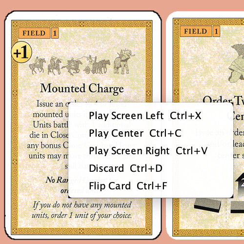
@uckelman I included screenshots of both sizes. Is there more you want to see?
Re usability: If font-size is a usability issue (e.g. myopic users) then it should be up to the user not the module creator. I would view the context-menu as belonging to the vassal system and not to the module.
as you probably know, on the Mac that is an Accessibility feature - by default (I think), press option whilst hovering over some text you want zoomed up. Works fine for the context menu individual line items, in a quick test.
It’s not a screenshot that I want (but thanks for those). I’d like to play with it myself on a few modules. Can anyone suggest a module that has some very long menus?
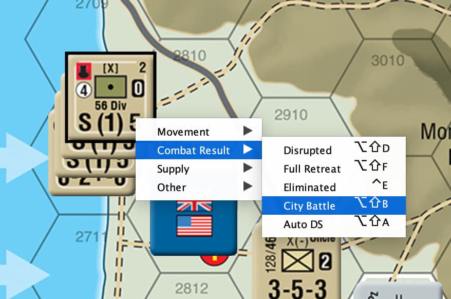
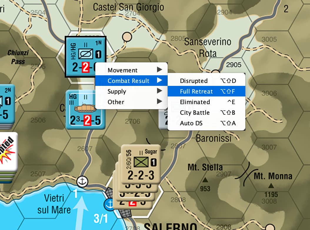
Flying Colors has a lot of options on the ships. Menus are nested, so none of the individual sub-menus is that long. I’ll have a look at some others. This is the module that came to mind as one where the original designer has inserted spaces to get the right-justified effect.
@uckelman I think Flying Colors will give a reasonable try out for you. There are a variety of modifier keys being used and a few double modifiers (no triples though as far as I can recall).
There are also a couple of places where the modifiers won’t be converted to graphics because it’s really text that is part of the command name.